What is CSS Grid?
CSS Grid Layout is a powerful layout system in CSS. Unlike Flexible Box Layout (Flexbox), which is designed for single-axis layouts (either row or column), CSS Grid is optimized for two-dimensional layouts, allowing for the control of both rows and columns. (I've also created a full course for CSS Grid that takes you from zero to master it with all it's properties and building real project's layout. check it out here)
Browser Support
CSS Grid is supported by all modern browsers, making it a reliable choice for web developers.
Flexbox vs. CSS Grid
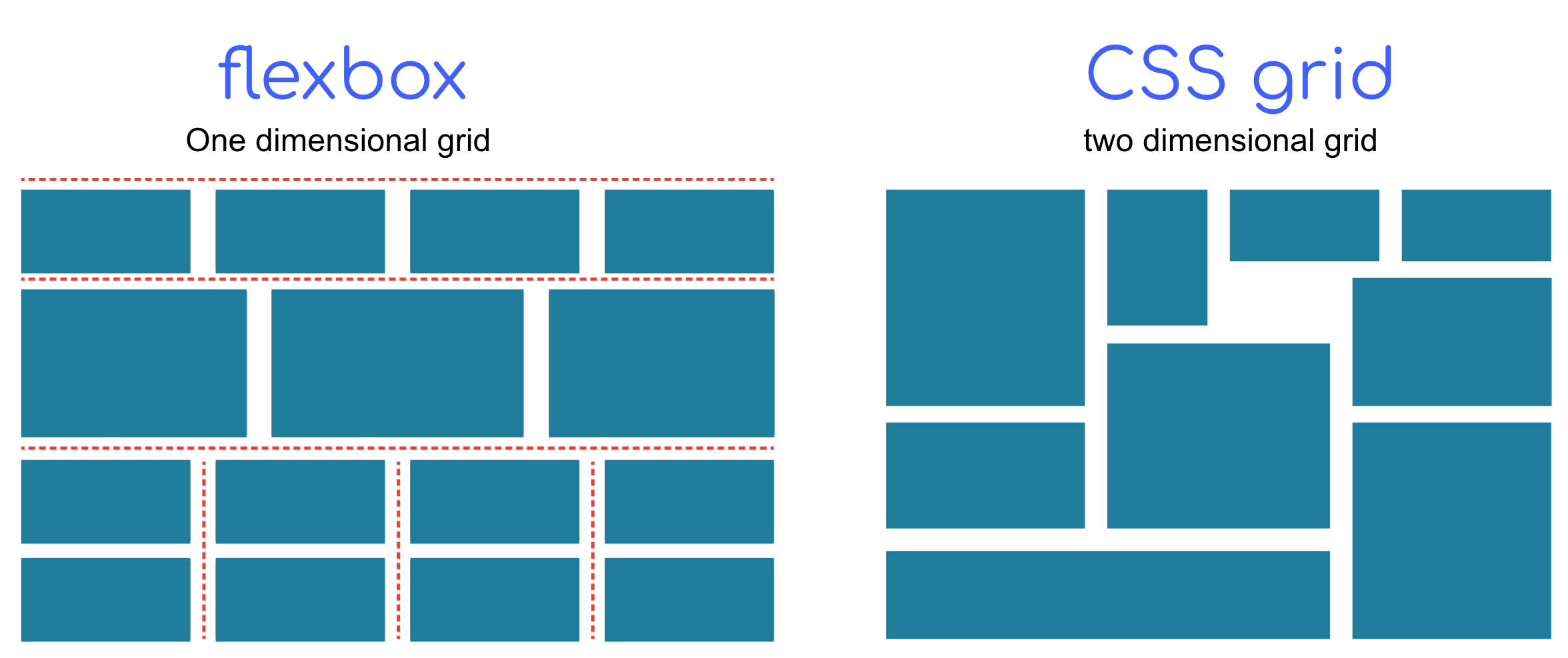
CSS grid is not an alternative for flexbox. it's new way of setting the layout additionally with using flexbox. by exposing here most differences that will lighten up to you when to use each one of them.
-
The dimention: Flexbox is one-dimensional layout (row or column). while CSS Grid is two-dimensional layout (rows and columns).

-
CSS Grid uses less markup: Check the following example in the slides that usually to achieve it, you have to use wrapper for the two left containers (
.content-one,.content-two). While using CSS Grid you can apply the layout without any additional wrappers.
-
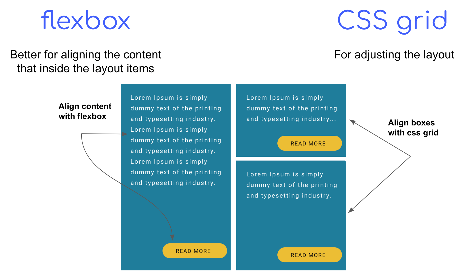
Content alignment: Here using flexbox is better and easier to align the content (text, buttons, etc..). CSS Grid can also do that, but you will have to write many code and handle different cases.

CSS Grid Terminology
Here are the keys that once you get to know you can apply easily any layout with css Grid. I've demonstrated it in the following animated slides for better understanding:
Container: The element on which display: grid is applied.
Grid Cell: The space between two adjacent grid lines.
Grid Lines: Lines that define the boundaries of cells.
Grid Track: The space between two adjacent grid lines, forming rows or columns.
Grid Area: The space surrounded by four grid lines.
Gap/Gutter: The space between rows and columns.
Basic CSS Grid Example
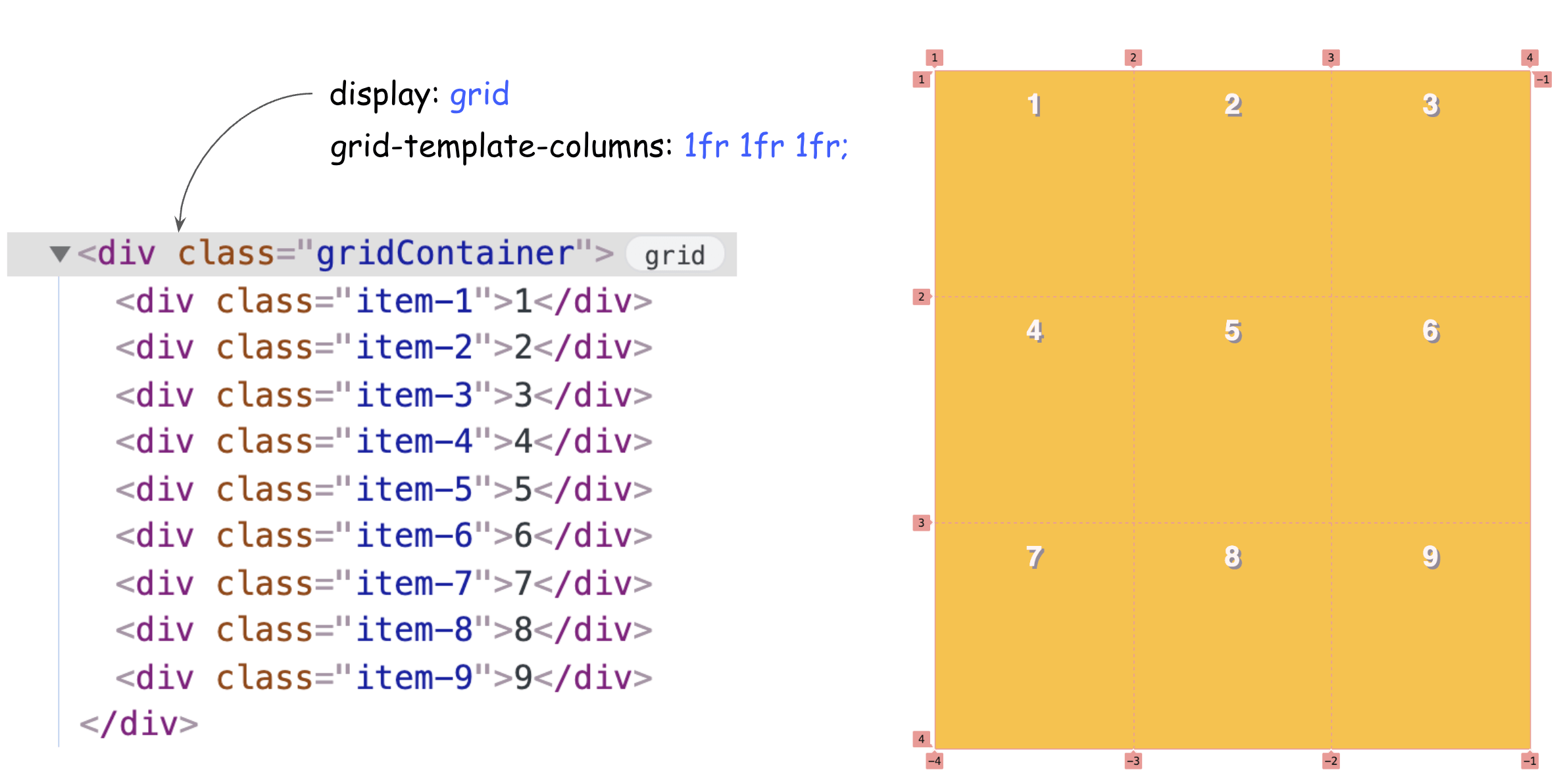
It's very simple to apply CSS Grid to your container and enjoy the new controls you will get:

You can see once you apply it to your main container, you can see by using the dev tools visual lines helping you to structure your layout.
CSS Grid Alignments
When it comes to alignment, CSS Grid offers various alignment properties. Check the following slides for better visual demonstration:
justify-*
justify-content: Aligns the grid container's content along the row axis.
justify-items: Aligns items inside their grid areas along the row axis.
justify-self: Aligns a single item inside its grid area along the row axis.
align-*
align-content: Aligns the grid container's content along the column axis.
align-items: Aligns items inside their grid areas along the column axis.
align-self: Aligns a single item inside its grid area along the column axis.
Conclusion
That's all what you would need to get started with CSS Grid. and it and for applying that step by step, I've created a full CSS Grid course that takkes you from first steps to master it and implement full landing responsive page using CSS Grid.